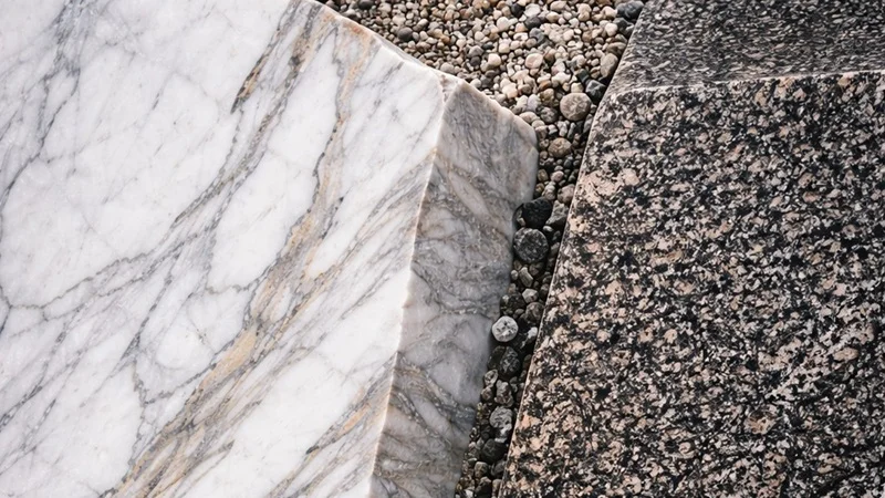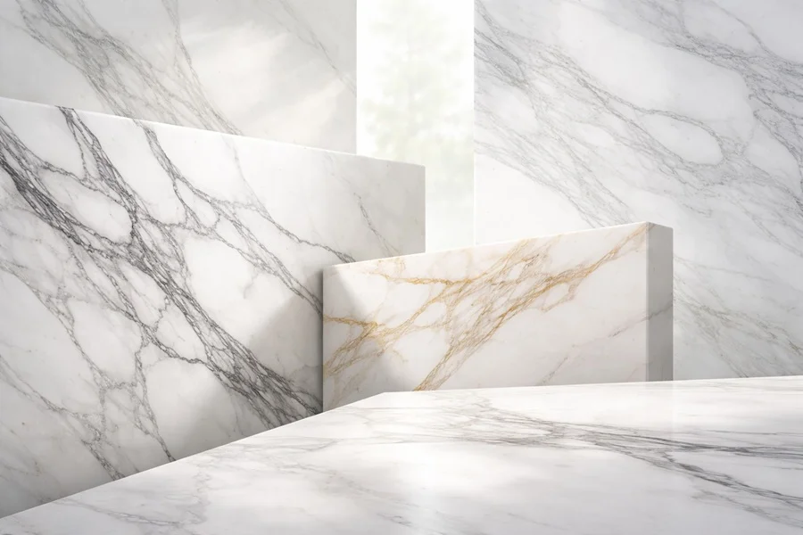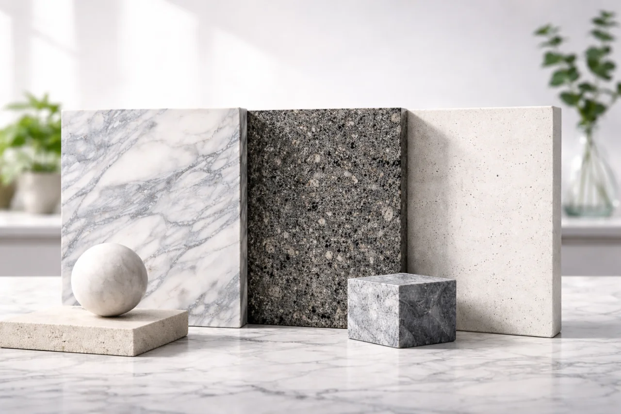

Marble is often selected for its veining, yet colour and base tone are equally important in shaping how a space is perceived. Whether a stone feels bright, warm, cool, or intense directly influences light, scale, and atmosphere. For this reason, marble colour is not only an aesthetic decision but a spatial design tool.
Browse the marble collection for Turkish slabs and read What Is Marble: Properties and Uses for formation context.
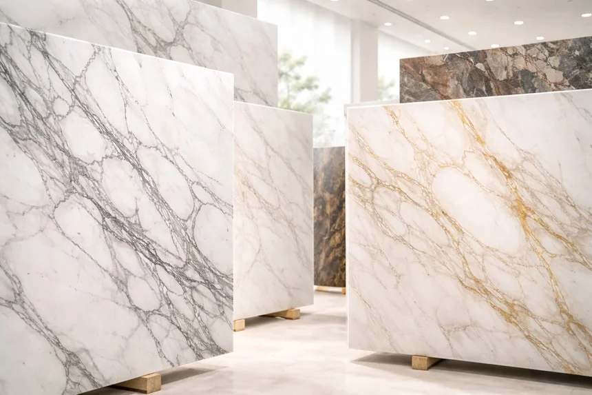
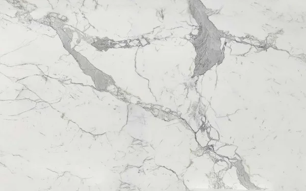
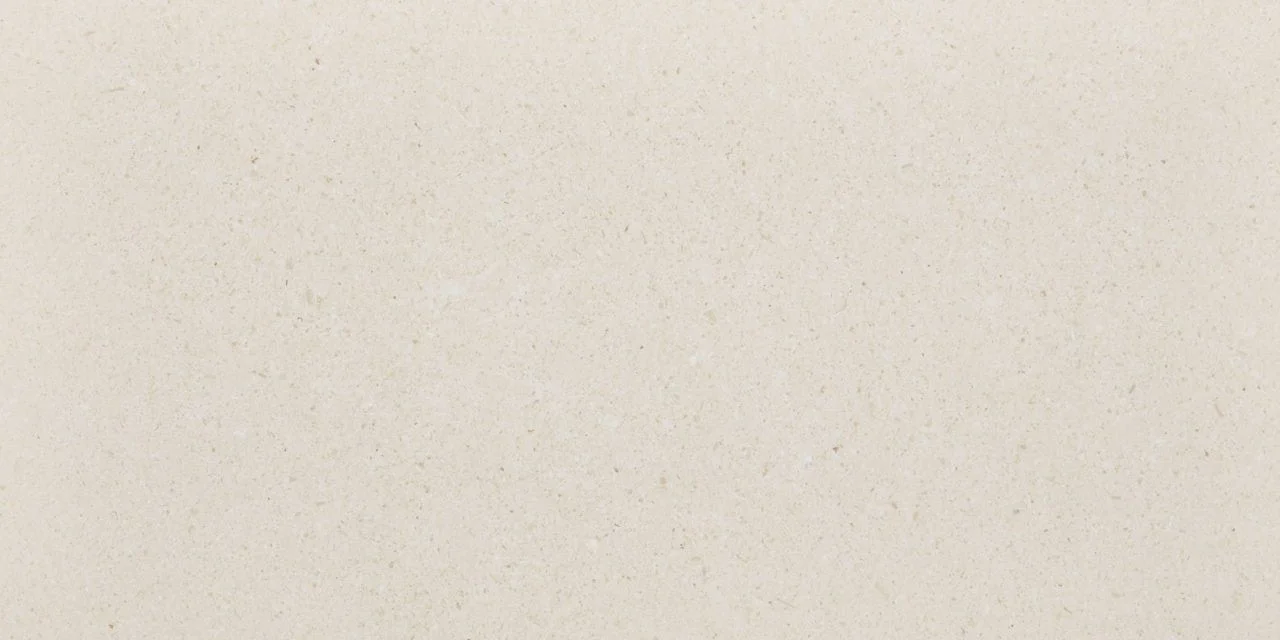
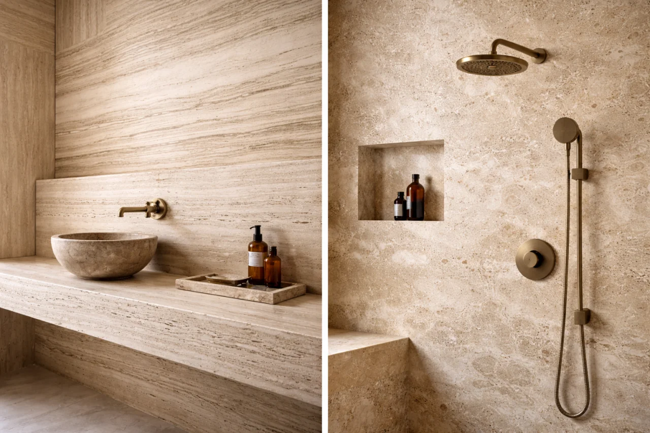
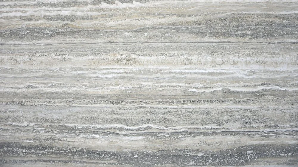
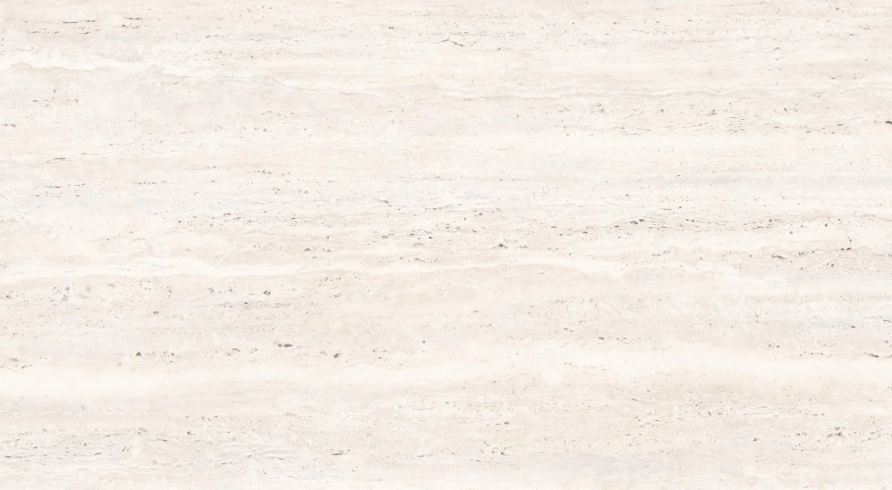
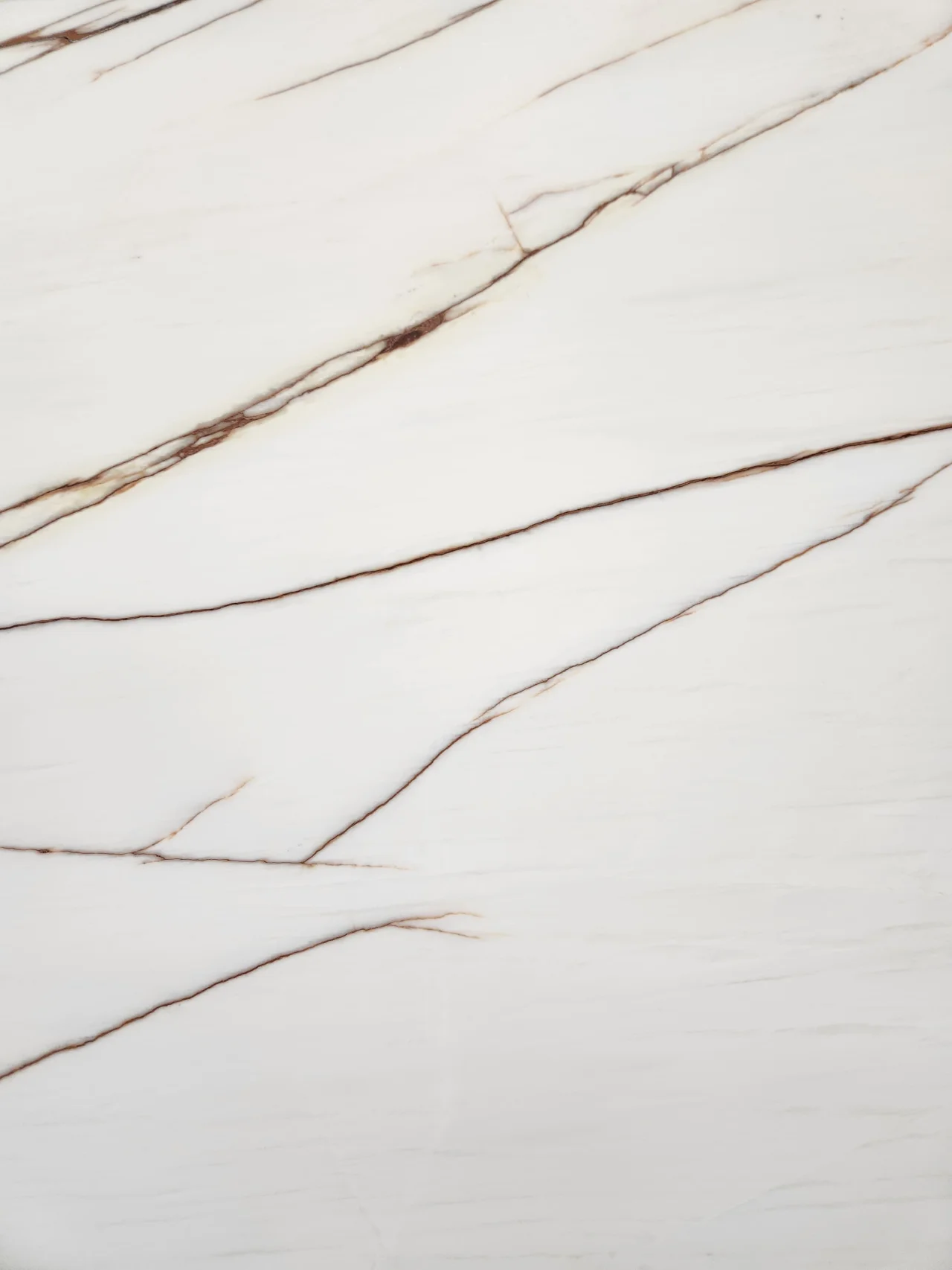
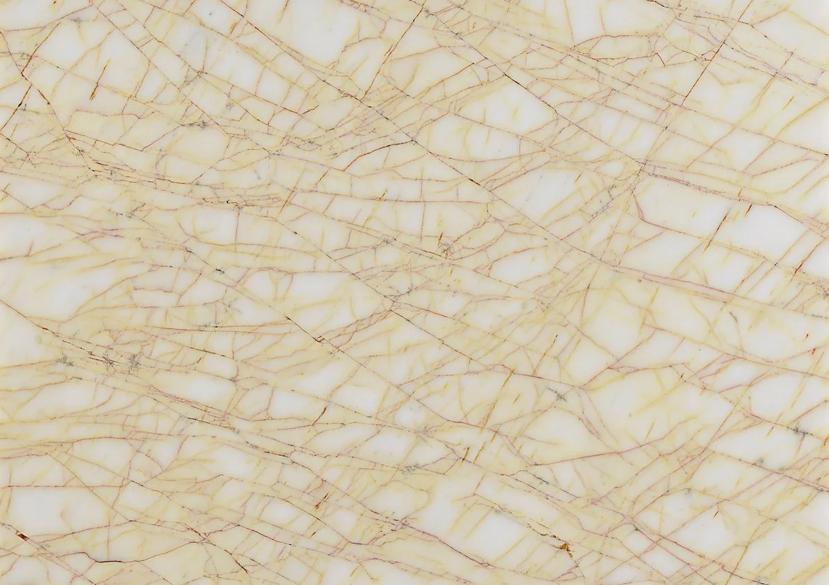
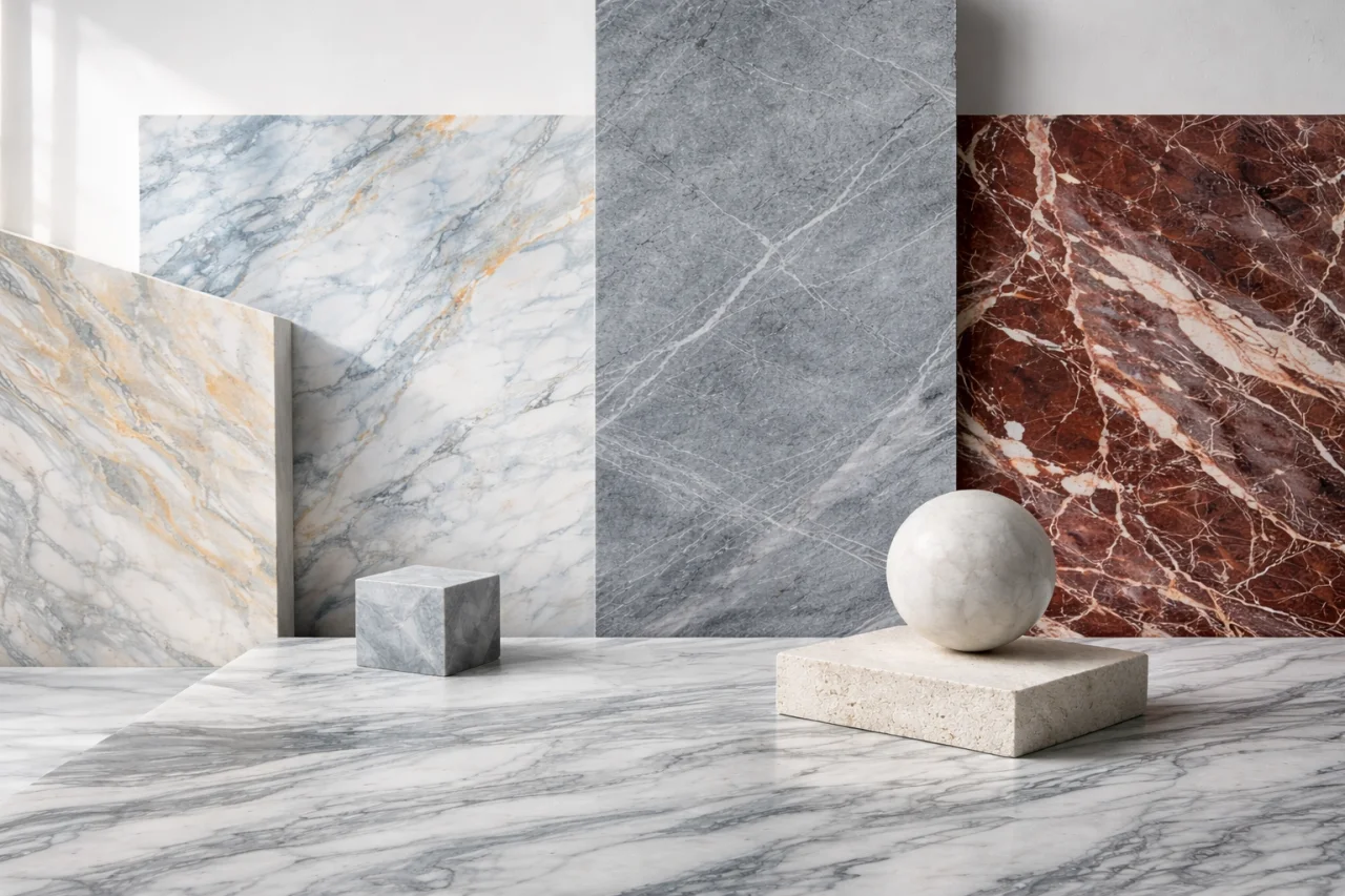
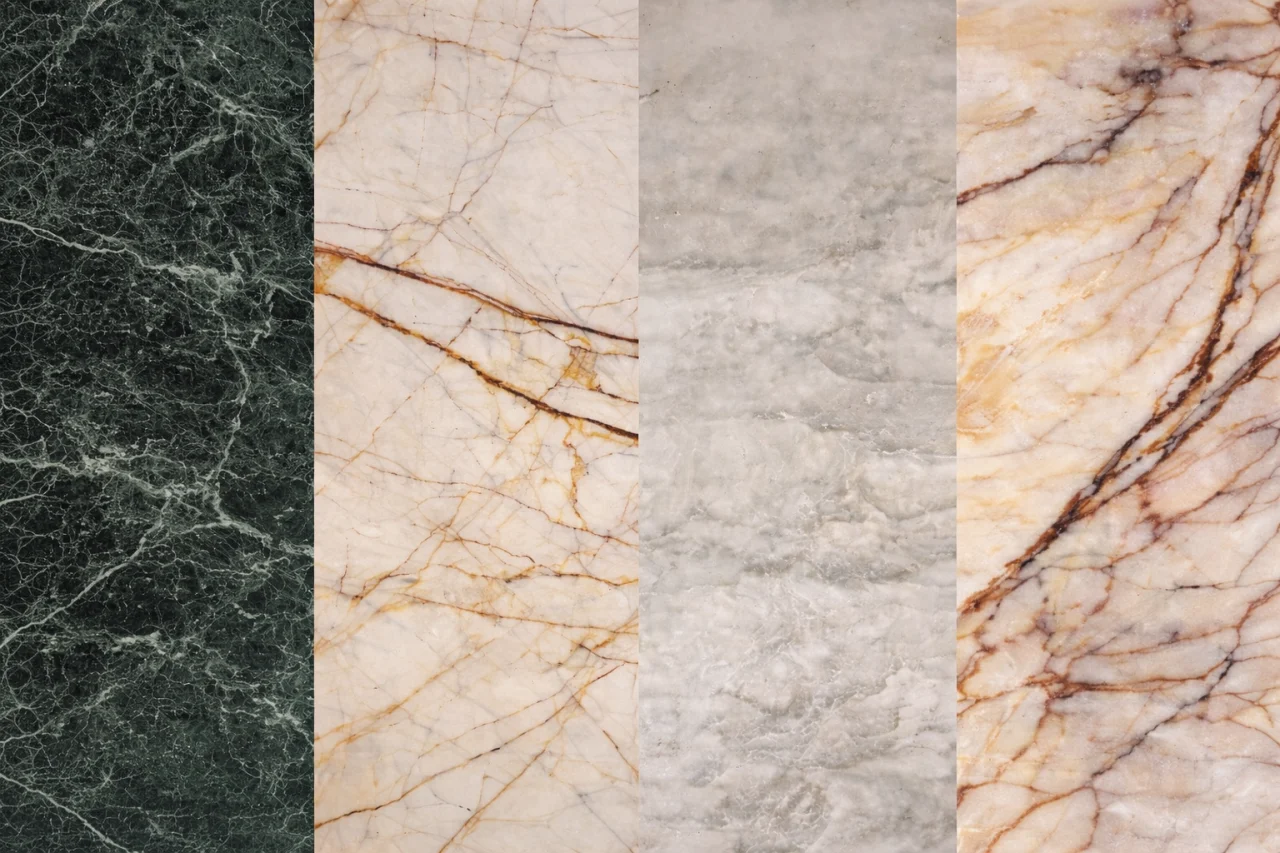
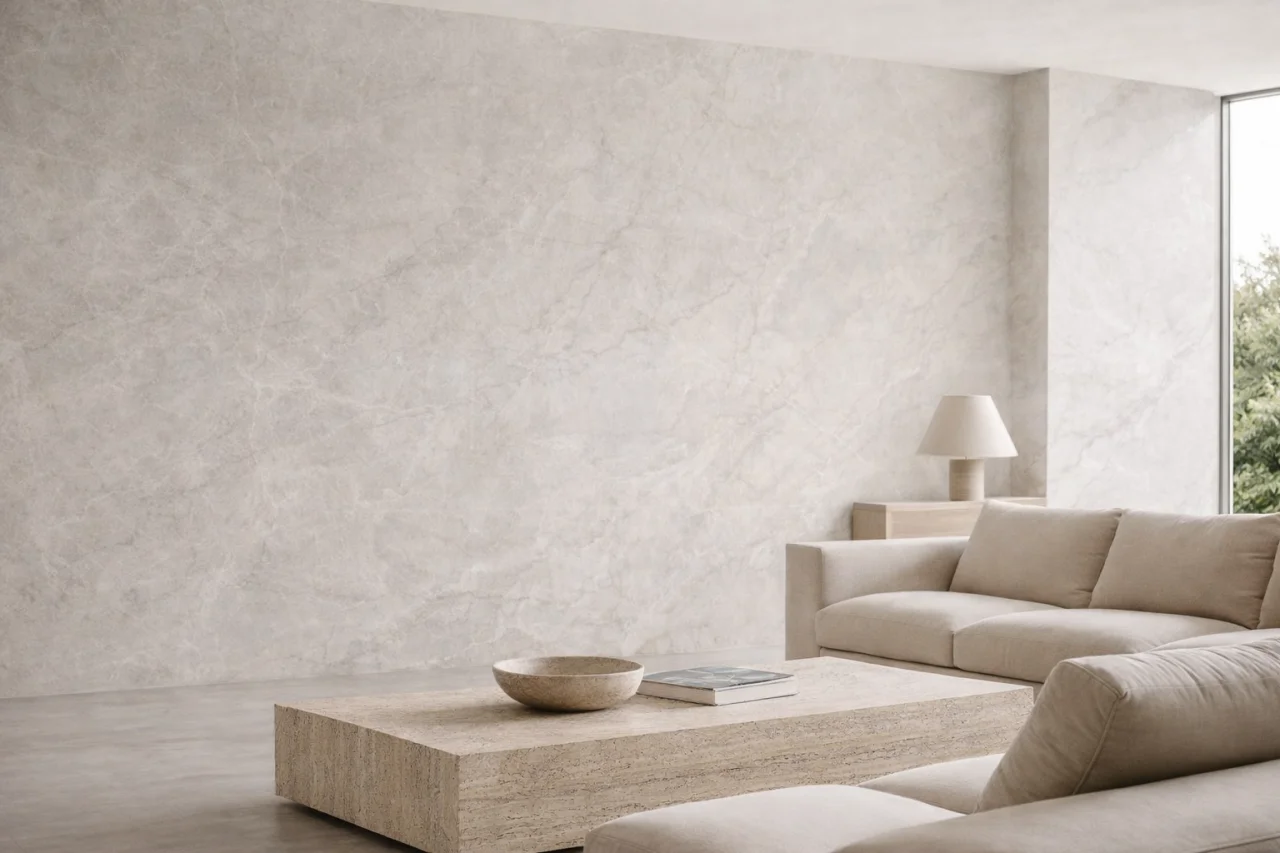
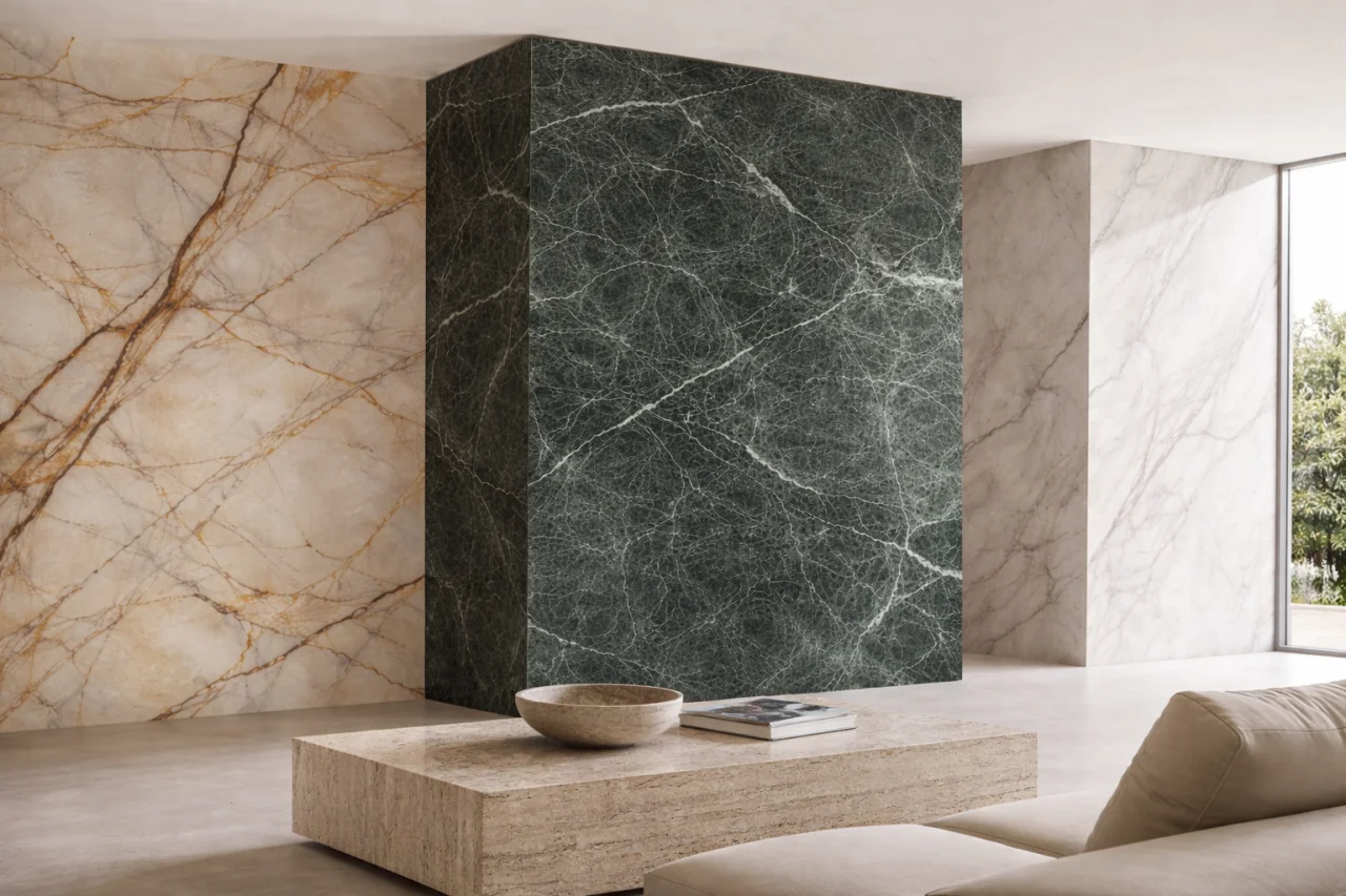
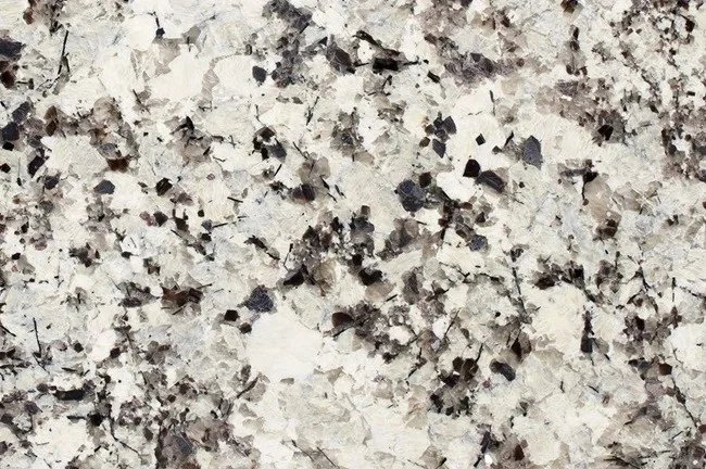
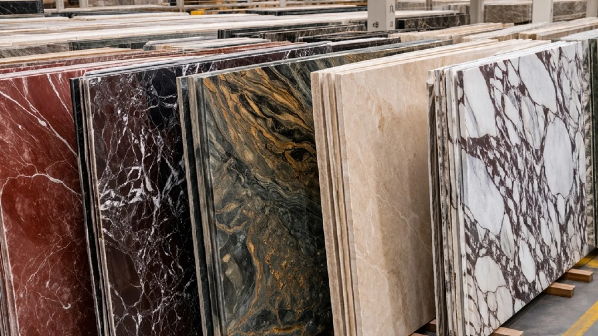
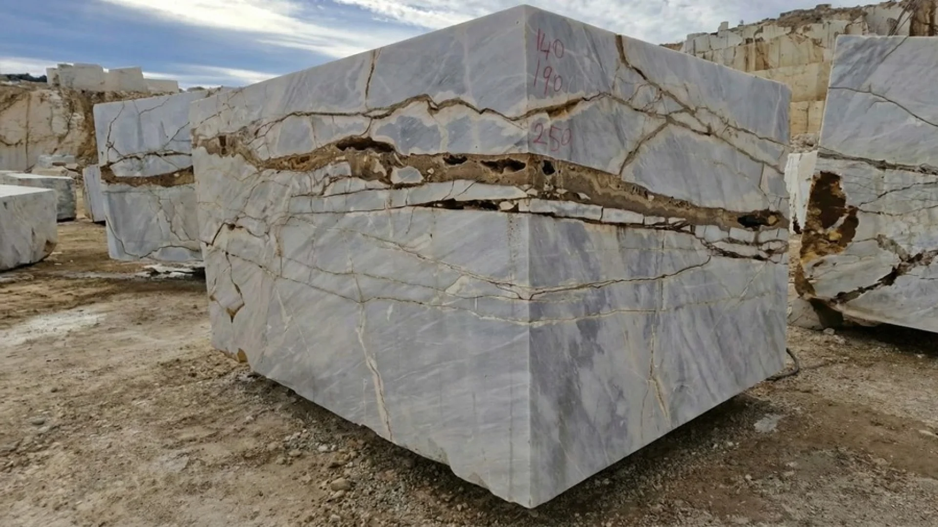
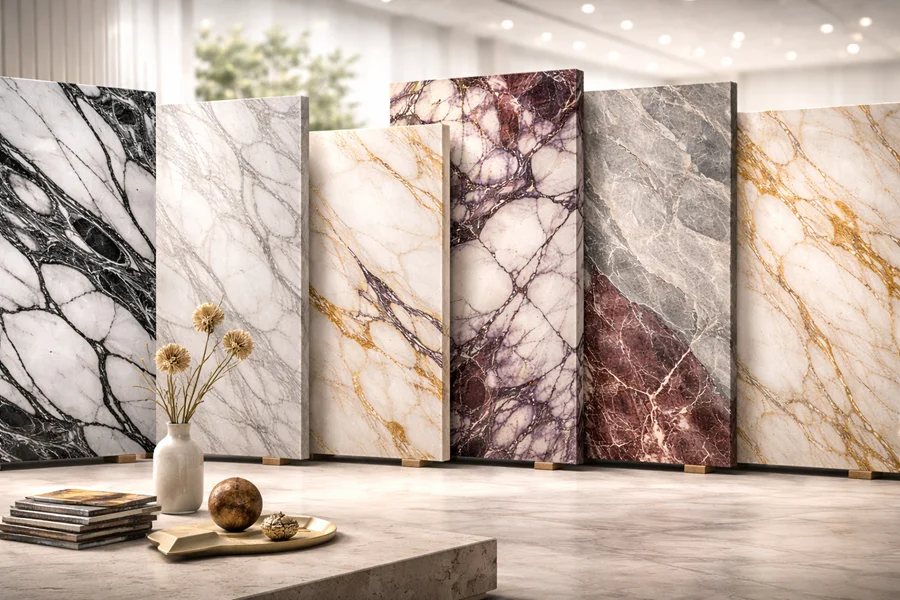
Light-toned stones on pale bases create openness and continuity. Marbles such as Panda White and Mugla White offer clean and bright surfaces, while Golden Spider dolomite and marbles like Calacatta Viola introduce stronger visual movement over a light base. Some act as calm backgrounds, while others become architectural focal points.
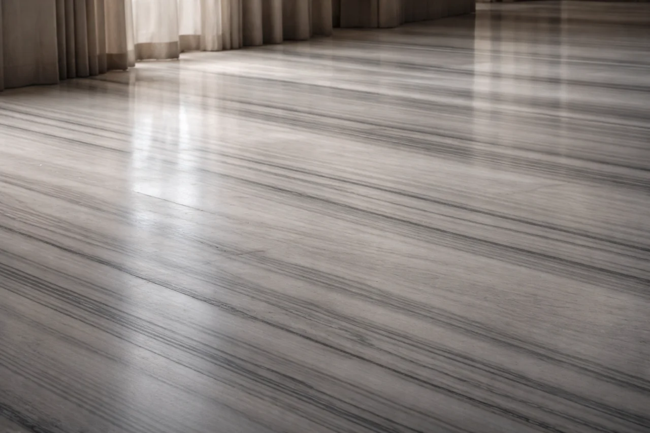
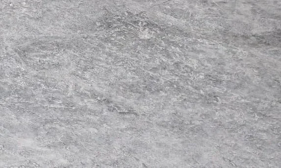
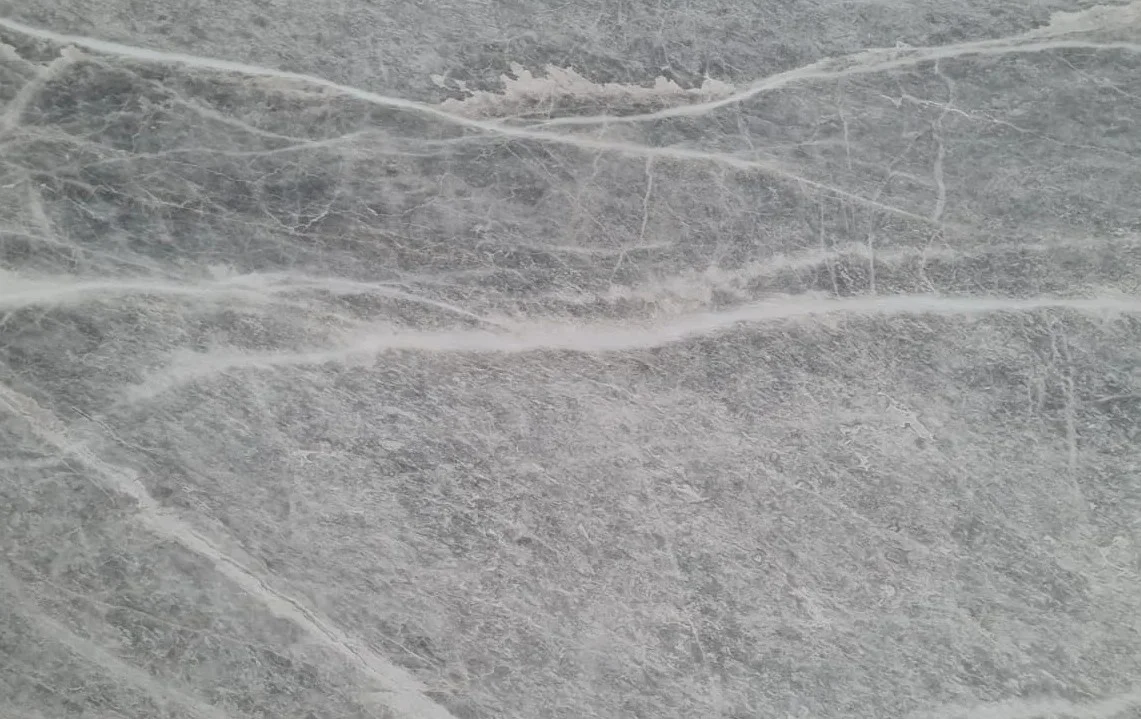
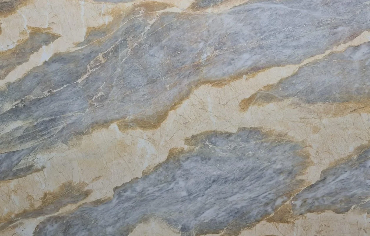
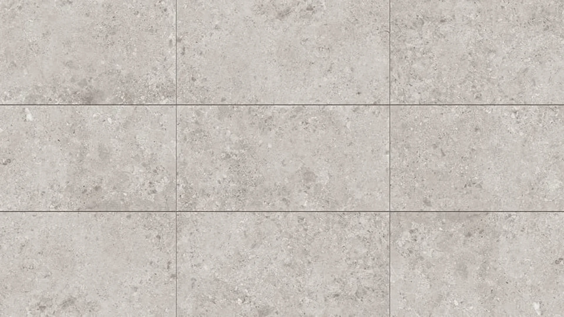
Grey and neutral marbles provide balance. Nordic Grey, Fior di Pesco, and Azure Crown offer controlled and consistent surfaces that connect different materials within a space. These tones are ideal for projects that require harmony without strong contrast.
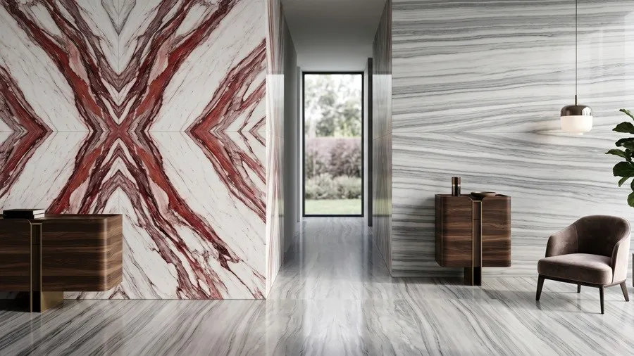
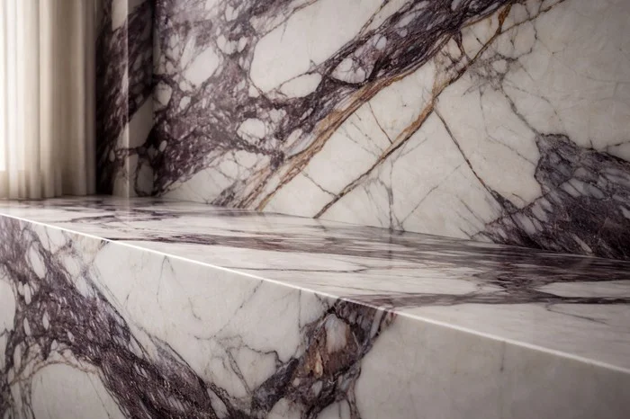
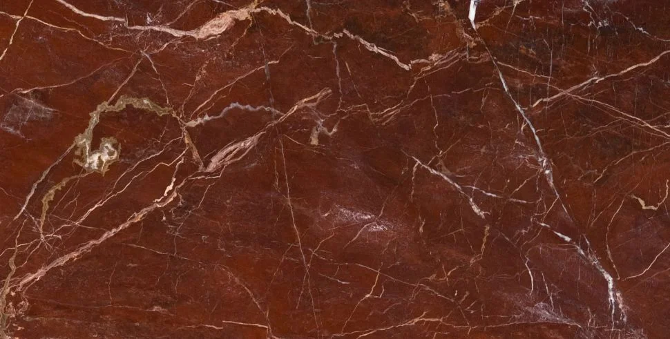
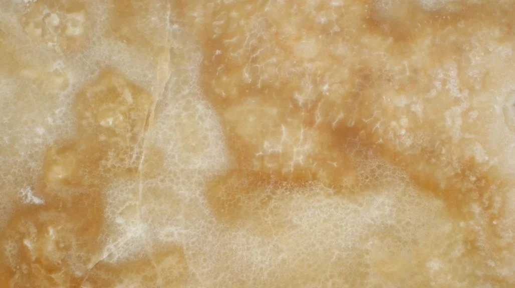
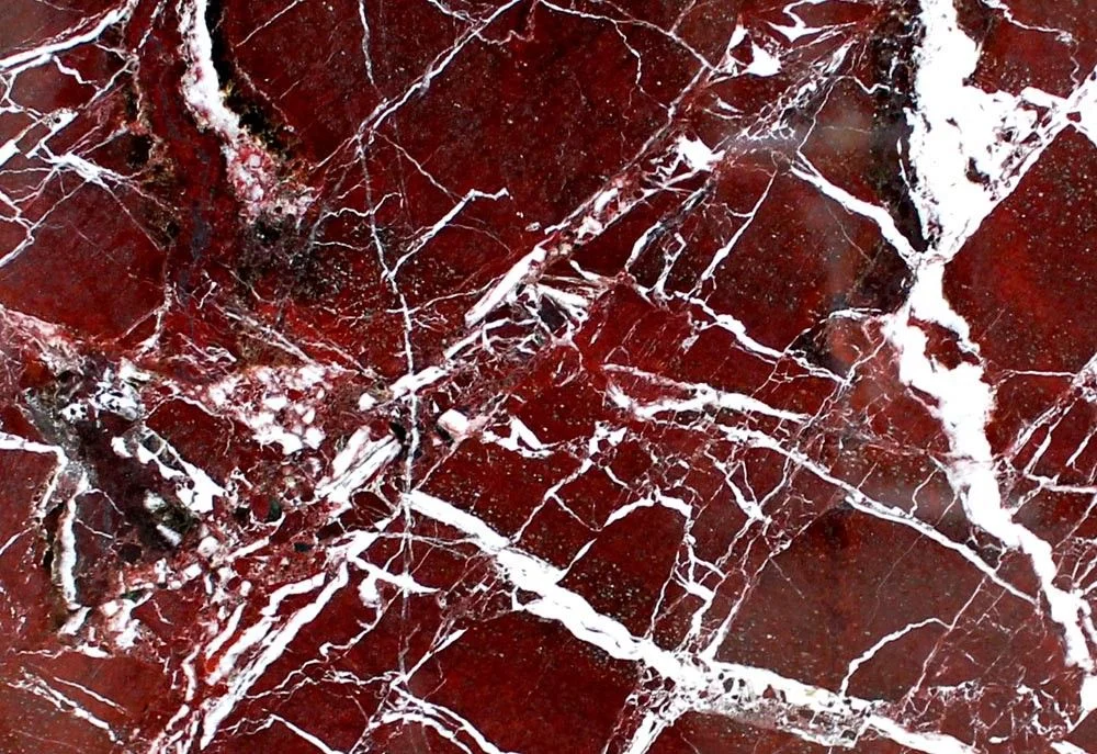
More intense colours introduce character. Rosso Laguna and Rosso Levanto define surfaces with strong visual presence and are often used in feature areas rather than across entire spaces.
Lighting plays a critical role in how marble colour is perceived. Light stones reflect brightness and expand space, while darker tones absorb light and create depth.
Many projects combine different marble tones. A neutral base may be paired with a more expressive stone to create visual hierarchy and balance.
Ultimately, marble colour defines both the appearance and the experience of a space.